Get Better Performance from the new Cricut Design Space Interface
A New Interface Without too Many Big Changes
Cricut Design Space went through some rough times in this past week with a lot of complaints about not being able to use the software! It seems they had a giant bug on their hands and using DS was next to impossible! The program would go around and around in loops and then not even resize on the screen. It was horrible and for me it was disastrous! I had a webinar on the go and doing a demonstration when all of a sudden the software updated itself!
It was downhill from there. I and my community were not happy!
Cricut should find a way to offer you the updates and not do them automatically. I think that would offer a good solution so that those nasty bugs do not interfere with daily activity. What if you were working on a project that needed to be completed in the next day or two? I know you would have been hopping mad!
When the bug was finally fixed (over a week later), the changes to the interface were good but I think it could have waited until they tested the release first!
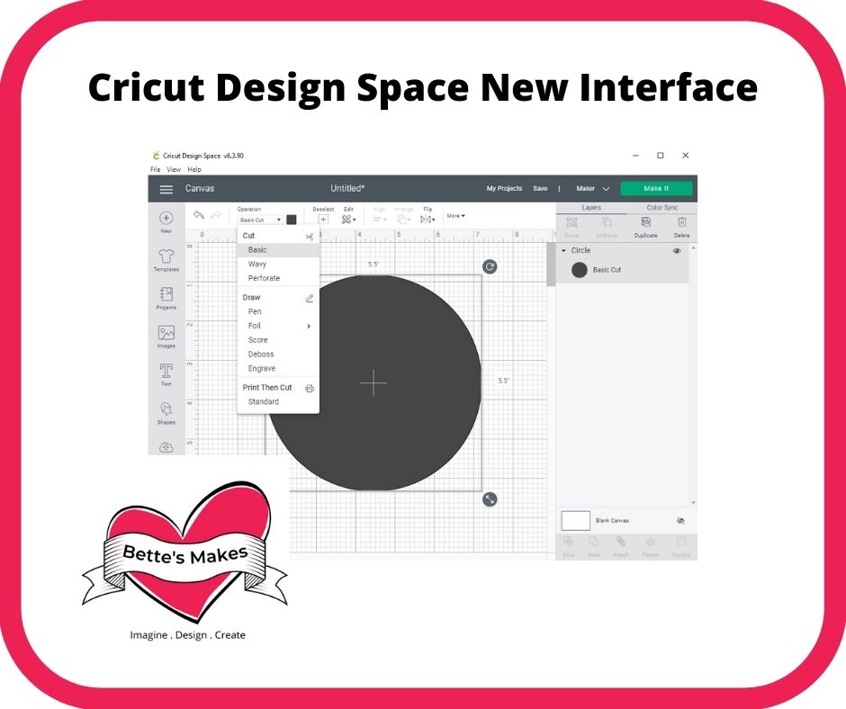
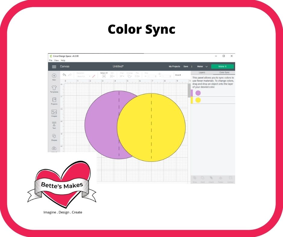
Here are the few things that I noticed to have changed and they are good changes, so read on.
This post does contain some affiliate links for your convenience (which means if you make a purchase after clicking a link I will earn a small commission but it won’t cost you a penny more)! Read my full disclosure policy.
Interface Changes
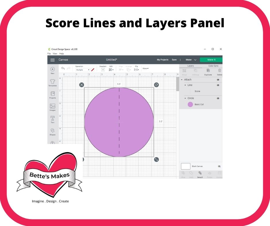
Score Lines and the Layers Panel
You still select and use your score lines as you have done in the past. So no changes here.
As for the layers panel - the images are more evident and easier to see what you have selected. They could still use some improvement here to make lines stand out more. I find the gray background makes it hard to see some of the objects.
Last Word
The changes to Cricut Design Space are not huge. These changes are certainly a step in the right direction with a lot more to go to really make this application truly robust!
Have fun with the Cricut Design Space new interface, you will learn to love it. Remember to be prepared for more changes coming almost weekly (as of late). Cricut does really try and make their products perfect for you and me!
Happy Crafting!
Please join me on Pinterest: https://Pinterest.ca/BetteMakerCreations
Join my Facebook group: https://facebook.com/BettesMakes
Follow me on Instagram: https://Instagram.com/BettesMakes
Subscribe to my YouTube Channel: https://www.youtube.com/c/BettesMakes


7 replies to "Cricut Design Space – The New Interface"
Thank you so much, for sharing this with your community. Good to know.
I still cannot get my cricut maker to design offline. It will “make it” but I cannot get it to ungroup..split..weld,etc
When you are in the projects section, click on the 3 dots below your project and select Save for offline. When working offline there are some limitations as follows: You cannot upload your own files to Design Space while offline, You cannot use templates while offline, You will only see projects, images, and fonts that you have saved before going offline.
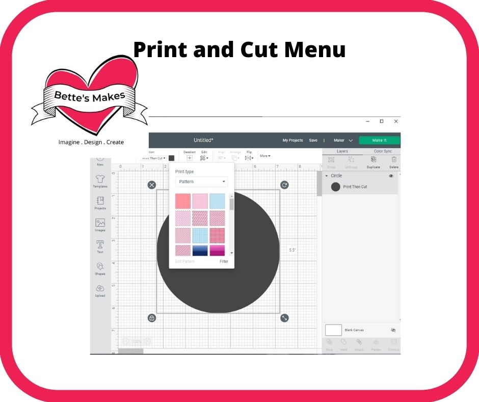
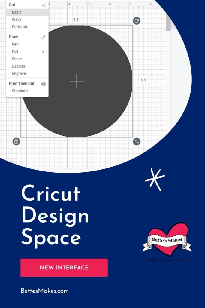
Bette I had been experiencing the frustration you described and I am so glad things are much better now. Thanks for the overview with the changes. Overall I found the reversing of the position of Print then Cut in this update to be helpful. I have many times uploaded a Print then Cut when I meant to save the cut Image.
II am so happy this has been a help to you.
Thank you for your overview! Makes it easier to understand!
You are most welcome!